Tamagui brings high performing, consistent, typed inline styles to React Native and React Web, plus composable UI components, a novel theme system and an optimizing compiler.
We’re excited to announce the first release candidate for Tamagui v2 is here!
We’ll do a little housekeeping first, so if you want to, skip to what’s new.
What makes it great
Tamagui brings many style features from CSS to native. Every style it supports works on both native and web, at both run-time and compile-time, and server-side as well as client-side.
In comparison to other solutions, Tamagui is especially strong at:
- Many features, high performance everywhere. Other solutions prioritize one platform, and bail out of the hard parts of web performance that require a compiler and a lot of careful work to get right. Some examples of large areas Tamagui does well - SSR safe spring animations, SSR safe light-dark themes, SSR safe media queries and Container all the above features working with CSS or springs, and so on.
- Top tier performance everywhere. A small example - you can choose from 4 animation drivers (CSS, Reanimated, Motion, React Native), per-platform, yet no matter which you choose you get proper SSR support—even media queries and dark mode render and hydrate without jumps or flickers.
- Type-safe inline styling that merges and optimizes. Inline styles are productivity boosts, but Tamagui adds type safety, easy/controllable merging, and an optimizing compiler that does partial analysis to optimize even logic-filled styling. It’s an underrated boost to productivity.
- Refined, styled and unstyled composable components. Great on web and native thanks to composable components, native adaptation, the Adapt primitive, and a lot of iteration.
- Robust. Tamagui has been developed actively for years, proven in large apps , and has more than tripled test coverage just in the last year.
During v1
- 8,500+ commits over 2 years (~330/month).
- 900+ issues closed.
- 136 new contributors (from 46 to 182 total).
- 289 test files with kitchen-sink tests running across all 4 animation drivers, plus many new deeper native integration tests with both Detox and Maestro.
- Released
@tamagui/build, which makes it trivial to publish npm packages that support CommonJS and ESModules, native and web without requiring any configuration at all when importing - whether it’s Metro, Node, Vite, or otherwise. - Platform, theme, and container queries, plus combined container and media queries.
- New compound components Tabs, Accordion, ToggleGroup.
- New unstyled versions of most components.
- The Takeout starter kit, and Bento components suite and patterns.
- A lot of low level work on performance, documentation, our CLI, and more.
- Improved theme generation packages, and the powerful free and paid theme builder.
New in v2
Version 2 is a huge release but the migration from v1 should only be moderate. We removed mostly deprecated APIs, aligned to web and modern React Native, improved performance and native library integrations, and dropped a few new features and components.
Find a list of breaking changes at the bottom of the post.
Features
Config v5
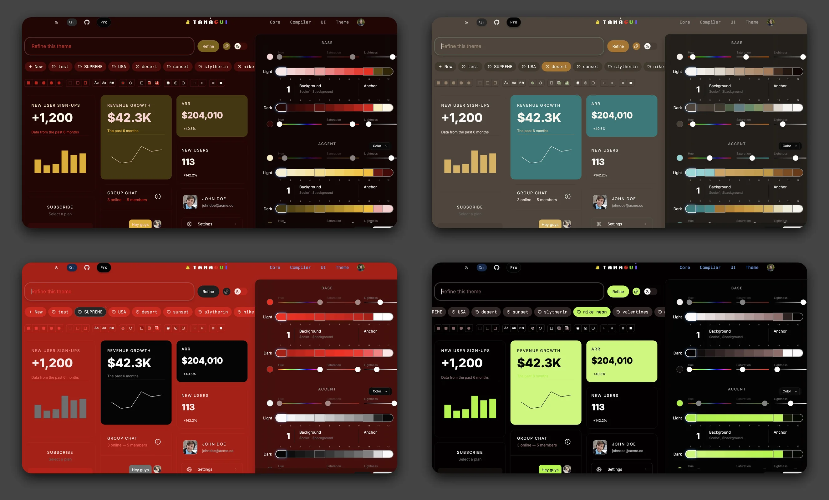
The default Tamagui configuration has been upgraded to v5 with a more complete design system and easier customization. See the Config v5 docs for full details.
More color themes - V5 adds gray, orange, pink, purple, teal, and neutral to the existing blue, red, yellow, and green palettes, all using Radix Colors v3 for improved accessibility.
Opacity tokens - New foreground and background opacity variants make subtle
overlays and borders easy: $color01, $color0075, $color005,
$background01, and more.
Shadow colors - Pre-tuned shadow opacities ($shadow1 through $shadow6)
that work well in both light and dark modes.
Expanded media queries - Height-based queries ($height-xs, $height-sm,
etc.), a $pointerTouch query for touch detection, and renamed size queries
($xxl, $xxs, $xxxs). The $sm through $xxl breakpoints now match
Tailwind CSS exactly (640, 768, 1024, 1280, 1536), making it easier to work
across both ecosystems. The smaller breakpoints ($xxxs, $xxs, $xs) are
designed for container queries where you need finer control below 640px.
Easy customization - The new createV5Theme helper lets you add or override
color themes with minimal boilerplate, working directly with @tamagui/colors.
Subtle variant - Import from @tamagui/config/v5-subtle for a more muted,
desaturated color palette. Or use adjustPalette and adjustPalettes to create
your own custom color transformations.
New Styles
See the Style API docs for the full reference, some highlights:
backgroundImage- CSSlinear-gradientandradial-gradientsyntax with token support.boxShadow- Full CSS box-shadow support including multiple shadows, spread, and inset. Accepts strings with your tokens.filter- Graphical filters likebrightness,opacity,blur.mixBlendMode- Blend modes likemultiply,screen,overlay, etc.isolation- Creates a new stacking context (auto|isolate)boxSizing- Box model (border-box|content-box).display- Pass-through withcontents.position- Now acceptsfixed, automatically converted toabsoluteon native. For easier media queries like$md={{ position: 'fixed' }}.borderCurve- Corner curve style (circular|continuousfor Apple’s “squircle”). iOS 13+ only.cursor- Cursor style. Full CSS values on web;auto|pointeron iOS 17+ (trackpad/stylus).textShadow- CSS text-shadow shorthand with token support:textShadow="2px 2px 4px $shadowColor". On native, only single shadows supported.border- CSS border shorthand with token support:border="1px solid $borderColor". On native, expands to individual width, style, and color properties.outline- CSS outline shorthand with token support:outline="2px solid $outlineColor". On native, expands tooutlineWidth,outlineStyle, andoutlineColor.
New Components
Menu
Menu provides dropdown menus with full keyboard navigation, submenus, checkbox items, and animations. On iOS and Android, it automatically renders using native platform menus.
ContextMenu
ContextMenu works like Menu but activates on right-click (web) or long-press (native). It includes support for preview content on iOS.
Input & TextArea
Input has been rewritten from scratch with a web-first approach - you write standard HTML input attributes and Tamagui automatically converts them to React Native equivalents on native platforms:
This replaces the React Native-style props like keyboardType,
secureTextEntry, and returnKeyType with their web equivalents. The old props
still work but are deprecated. See the Input docs for
the full migration guide.
Image
The Image component follows the same web-first
philosophy as Input. It uses standard HTML <img> attributes like src, alt,
loading, and decoding as the primary API, with automatic conversion to React
Native equivalents on native.
On native, you can choose your image loading adapter - use the built-in React
Native Image, or integrate with optimized libraries like expo-image or
react-native-fast-image for better caching and performance.
Sheet, Button, ListItem, Select
All were re-written internally to retain much the same API surface, but align better to the web, and run dramatically faster and better.
Select on web and Sheet on native got big upgrades.
Motion Animation Driver

The all powerful Motion animation library comes to Tamagui as an animation driver, bringing real innovation to web aimations.
The driver is still somewhat experimental, we’re still working through some very subtle issues with sending updates rapidly, and are working them to isolate it.
What makes this even more interesting is that Tamagui completely re-wrote the
internal component logic to allow a new avoidReRenders path option for
animation drivers. When true, all group, media, pseudo, and some theme styles
all move out of React.
Combined with Motion’s support of the off-thread Web Animations API , and it makes for really incredibly smooth feeling apps.
We noticed a large gain in performance in a large app by just swapping to the driver, and the animations feel great — see them for yourself on this site. Just note, there’s a can be occasionally hiccups with some enter styles. There’s a way to work around this, but then you de-opt other parts. We’re sure we’ll get Motion out of beta soon, and even in it’s current state it’s worth considering.
Reanimated Driver
The Reanimated driver
comes back in style with worklet and avoidReRenders support. This means
animations run entirely on the UI thread without triggering React re-renders,
giving you much better performance for complex animations on both web and
native.
The Moti driver (@tamagui/animations-moti) is now deprecated in favor of the
Reanimated driver
(@tamagui/animations-reanimated). This removes a dependency and fixes some
compatibility issues. If you’re using @tamagui/animations-moti, switch to
@tamagui/animations-reanimated - the API is the same.
Swap Animation Drivers Inline
You can now configure multiple animation drivers and select per-component using
the new animatedBy prop. This serves two important purposes: it allows mixing
drivers more granularly, and it enables the compiler to better optimize. See the
animation drivers docs for full
details.
The compiler can optimize better with this pattern, and you can now lazy load a driver with a function:
Transition Delay
All animation drivers now support delays:
This works with CSS, React Native Animated, Reanimated, and Motion drivers.
Enter/Exit Transition Control
The transition prop now supports different animations for enter and exit. This
is useful for creating asymmetric animations where elements enter slowly but
exit quickly, or vice versa:
This works on all four animation drivers. See the animation docs for more details.
Pseudo-Style Transitions
Pseudo-style props (hoverStyle, pressStyle, focusStyle) now support their
own transition property. This enables CSS-like semantics where entering a
state uses that state’s transition, and exiting uses the base transition:
This pattern creates snappy, responsive interactions where elements react
quickly to user input but settle back smoothly. Works with group pseudo states
too ($group-card-hover). See the
animation docs for details.
Popover transform-origin
Popover and Tooltip now
automatically calculate the correct CSS transform-origin based on placement
and arrow position. This means scale animations naturally “grow” from the anchor
point where the content connects to the trigger.
The transform origin adjusts automatically based on the final placement - if the
popover flips from bottom to top, the origin updates accordingly. This
creates polished, native-feeling animations without any manual configuration.
Consistent Active Styling
Components with toggle/selection states now support consistent activeStyle and
activeTheme props for styling their active states:
- Switch - Styles applied when the switch is on
- Checkbox - Styles applied when checked
- ToggleGroup.Item - Styles applied when the item is selected
- Tabs.Tab - Styles applied when the tab is active
This replaces a variety of inconsistent APIs in v1.
Faster, Lighter, more Consistent Components
Several components have been significantly simplified:
Button - Rewritten from scratch with ~60% less
code. No longer uses the slow useProps hook internally. Now supports all
web-standard HTML button attributes (type, formAction, formMethod, name,
value, popoverTarget, etc.). Defaults to type="button" to prevent
accidental form submissions.
ListItem - Rebuilt with context-based styling.
Removed text style props (fontFamily, fontSize, etc.) and internal spacing
props (spaceFlex, scaleSpace) for composable component API. Much faster
rendering.
Select - SelectItem is based on ListItem so is likewise much faster, and gains an optional floating indicator. SelectLabel is now a simpler SizableText-based component instead of depending on ListItem.
Icons - Themed icons now use a fast path that skips the heavy style resolution when no media queries are used, significantly reducing re-renders in apps with many icons.
Progress - Now SSR-friendly with percentage-based transforms on web that render correctly without client-side hydration. Bouncy animations no longer overshoot past the container edges.
Tabs - activeStyle and activeTheme props
replace the old Theme wrapper approach. activationMode now defaults to
'manual' (click/Enter to activate) matching web standards.
Group - Dramatically simplified. No more magic child cloning.
Headless and Unstyled Components
We’re expanding headless components in v2. Many components now have three variants:
- Styled - Full Tamagui components with default styles
- Unstyled - Uses a
createXfactory allowing fully custom styling - Headless - Zero dependency on
@tamagui/core, just hooks
The headless packages (@tamagui/switch-headless, @tamagui/checkbox-headless,
@tamagui/radio-headless, @tamagui/tabs-headless) provide hooks like
useSwitch, useCheckbox, useRadioGroup, and useTabs that handle all the
state management, accessibility, and keyboard navigation - letting you bring
your own styling solution.
This makes Tamagui components usable even if you’re not using Tamagui for styling. For now it’s a subset, but we plan to continue expanding headless exports throughout v2.
@tamagui/react-native-web-lite
React Native Web has slowed down development and has various issues in modern JS
projects. We built @tamagui/react-native-web-lite by translating
react-native-web to TypeScript, moving to a modern ESModule setup, and
enabling tree shaking.
If you’re using Tamagui for most styling, you can save a significant amount of
bundled JS on web by aliasing to this package. It’s not perfectly compatible
with react-native-web - it strips out the style system to share Tamagui
internals - but for Tamagui-first apps, it’s a nice optimization.
Component Scope
Dialog, Popover,
Sheet, and Tooltip now
support a scope prop that lets you mount a single instance at your app’s root
while placing triggers anywhere in your tree. This is a significant
performance win - in testing with large apps, we found it greatly improved UX
by eliminating the overhead of mounting full overlay components inline.
Instead of each Tooltip or Popover in a list rendering its own portal, content, and animation logic, you mount one instance at the root and scatter lightweight triggers throughout your app. The triggers are just simple components that communicate with the shared instance via context.
This pattern is especially valuable for data-heavy views like tables, lists, or dashboards where you might have dozens or hundreds of interactive elements that need tooltips or popovers.
New Colors
@tamagui/colors has been updated to Radix v3, old colors are available at
@tamagui/colors/legacy. See the Colors docs for full
details.
Compiler Improvements
The compiler has been significantly improved in v2, especially for native. Most notably, the experimental theme optimization setting is now on by default, and stable. This means better performance on native without any configuration needed.
Native Portals
Tamagui’s portal-based components (Sheet, Dialog, Popover, Select, and Toast) now support true native portals via react-native-teleport .
Native doesn’t support portals. Tamagui v1 worked around this by abusing private APIs and automatically re-propagating its own contexts, but your custom contexts would break. This also added lots of overhead.
In v2 you can now add react-native-teleport, then import:
Now all components that portal work better and faster. See the Portal docs for details and alternative approaches like component scoping.
Native Sheet Gestures
Sheet now has optional integration with
react-native-gesture-handler for much smoother performance on native. Install
react-native-gesture-handler and add the setup import before any Tamagui
imports.
See the @tamagui/native docs or
Sheet docs for full details.
Cross-Platform Pointer Events
Pointer events (onPointerDown, onPointerUp, onPointerMove,
onPointerEnter, onPointerLeave, onPointerCancel) now work cross-platform.
On native, they’re mapped to touch events with a normalized event shape matching
the web API: The setPointerCapture and releasePointerCapture APIs are
supported for drag scenarios where you need move events to continue firing even
after the pointer leaves the element bounds.
CLI Improvements and Agent Prompt Generation
The Tamagui CLI has new commands for building and working with your design system:
tamagui build- Pre-compile components in-place for production. Works with any bundler and supports wrapping your build command to automatically restore files after.tamagui generate- Build your full Tamagui configuration and output CSS. Validates your config and pre-generates your design system.tamagui generate-css- Generate thetamagui.generated.cssfile from your config. Use--outputto specify a custom output path.tamagui generate-prompt- Generate an LLM-friendly markdown file from your config, documenting all tokens, themes, components, and shorthands for use with AI assistants.tamagui check- Scan for inconsistent dependency versions across your project.
We recommend generating your prompt and committing to your repo, even before you do your full upgrade to version 2, as it will help agents understand your Tamagui config better.
Smaller Bundle Size
The @tamagui/core bundle has been reduced by ~32% (from ~37KB to ~25KB
gzipped). This was achieved through several optimizations to color parsing,
expensive gesture handling, and automatically trimming optional theme generation
code.
Breaking Changes
- Shadow colors output opacities using
color-mix()which may break snapshot tests or any code testing the expected parsed format. - Removed
@tamagui/react-native-use-responder-events. If you were usingonResponderGrant,onResponderMove,onResponderRelease, oronResponderTerminateprops on web, switch to standard pointer events (onPointerDown,onPointerMove,onPointerUp) or touch events. On native, use React Native’s built-in responder system. - Config v5 changes from v4. Media query names change (
2xl→xxl,2xs→xxs), style defaults align with React Native. See Config v5 docs. - React Native 0.81+, React 19+, and TypeScript 5+ required. Tamagui 2 targets React Native 0.81, React 19, and TypeScript 5 and above with New Architecture support. This enables significant new style features, improved type inference, and simplified internals.
- Default flex and position styles align with the latest React Native versions, (you can change settings to keep the legacy behavior).
- Button and ListItem lose direct text style props for better performance and consistency.
- useTheme no longer takes props; use the Theme component instead.
- Removed web-only
onHoverInandonHoverOutin favor of standard web events (onMouseEnteroronPointerEnter). - Added comprehensive web event handler support including keyboard, pointer, drag and drop, clipboard, and scroll events.
- Moved from ThemeableStack to View for most base components in UI.
- Removed deprecated
Stackfor the identicalView. - Renamed the
animationprop totransitionfor clarity and consistency. - Removed
<Theme inverse />andthemeInverseprop - see inverse themes guide. - Removed the
maxDarkLightNestingandcssStyleSeparatorsettings. - Removed
spaceandspaceDirectionprops - usegapinstead. - Tabs
activationModenow defaults to'manual'instead of'automatic'. This means focusing a tab no longer changes the active tab - you must click or press Enter/Space. This matches web standards. - Group component simplified:
Group.Itemis now required (no more auto-cloning direct children). Removed props:space,separator,scrollable,showScrollIndicator,disablePassBorderRadius,forceUseItem. Children now control their own sizing - apply size/responsive props directly to child components. Add<Separator />manually between items when needed. - Moved
<Spacer />from core to@tamagui/spacer. - Moved all settings on
createTamaguito thesettingsobject. - Native portals no longer auto-import React internals hack. If you want native
portals for better context preservation, add
import '@tamagui/native/setup-teleport'at app startup. See Portal docs. - LinearGradient on native now requires setup import. Add
import '@tamagui/native/setup-expo-linear-gradient'at app startup. See LinearGradient docs. - Removed React Native accessibility props in favor of web-standard props:
accessibilityLabel→aria-labelaccessibilityRole→roleaccessibilityHint→aria-describedbyaccessibilityState→aria-disabled,aria-selected,aria-checked,aria-busy,aria-expandedaccessibilityValue→aria-valuemin,aria-valuemax,aria-valuenow,aria-valuetextaccessibilityElementsHidden→aria-hiddenaccessibilityViewIsModal→aria-modalaccessibilityLiveRegion→aria-liveaccessible→tabIndex={0}focusable→tabIndexnativeID→id
Goals
Our main goal with version two is stability. Tamagui started as a side project with incredible scope and maintained an ambitious stance towards landing large features and internal improvements.
Speaking for myself now: I personally pushed releases too fast, and as a result burned too many of our users with regressions. We generally fast-followed with fixes, but that isn’t good enough.
I’d like to apologize for that, sincerely. We had a v2 nearly ready over a year ago, but it felt right to push back the release until we felt confident we’d fixed nearly every major issue, and overhauled our testing setup.
React Native is difficult to test, so it took us a while to build it out, but I’m incredibly happy with where we’re at now. On every commit we’re running integration tests on iOS and Android across every complex component, alongside a few thousand web and core tests.
Testing
The testing infrastructure has been completely rebuilt since v1. At the v1.0 release we had 13 test files and a single CI workflow. Today we have 127 test files across 5 testing frameworks with dedicated native testing infrastructure.
Frameworks added:
- Playwright for E2E and integration tests
- Vitest for unit and integration tests
- Jest + Detox for iOS and Android native E2E testing
- Maestro for iOS flow-based testing
Multi-driver testing: Every Playwright UI test runs four times, once for each animation driver. This catches driver-specific regressions that would otherwise slip through.
What’s next
Tamagui is quite mature in terms of features, foundation, and performance. AI Agents generate its code exceptionally well because it’s been in wide use and well documented for years. For this reason, we are avoiding large syntax or theme changes, for now.
We’re going to deprecate a variety of things in 2.1 that will be planned for 3.0, and will follow with 3.0 a lot quicker than this major took.
There’s still some work to do in terms of simplifying internals, we’d like to move both our built-in styles and standardized sizing to be done in a more clear way where it’s easy to unplug either. Other broad goals include better alignment to the web, simpler onboarding, more components, better components, and more native component integrations.
Thanks
A huge thanks is owed to our amazing team, which has persisted through this giant release and throughout the last two years fixing issues.
Special thanks to Quan Nguyen (@LionelNguyen19 ) for extensive work on Takeout documentation, Radix v3 color updates, and theme improvements. And to Dave Mkpa-Eke (@1804davey ) for numerous bug fixes across Progress, Input, ContextMenu, and other components, as well as the new Select.Indicator feature and blog improvements.
Consulting
We’re also testing out consulting this year through Add Even . We built a production app for a company late last year in record time — three weeks from start to approval in app stores — and that was before we spent the last few months refining everything based on that project.
If you’d like to launch something in record time that’s as ambitious as possible, and is beautiful inside and out — please do get in touch .